Sunday, March 30, 2014

Japanese x and + Block Tutorial for 12.5" blocks

x and + with some selvage of course!
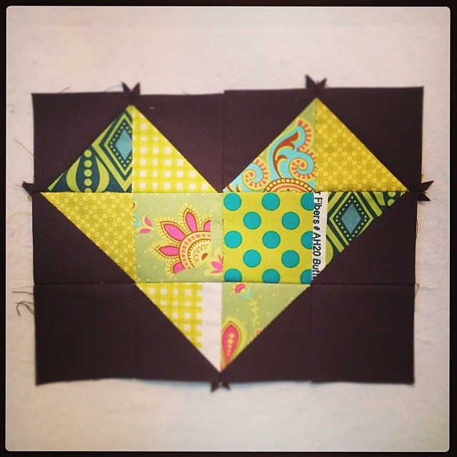
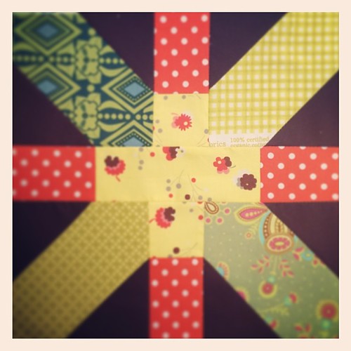
I began my blocks using Brenda's sketch for a 12.5 Japanese x and + block which you can find here.
I decided to take her sketch and create a step by step tutorial (I'm a visual learner...you?)

x and + block 12" finished
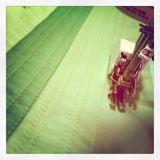
Step 1. Choose and Prep your fabric
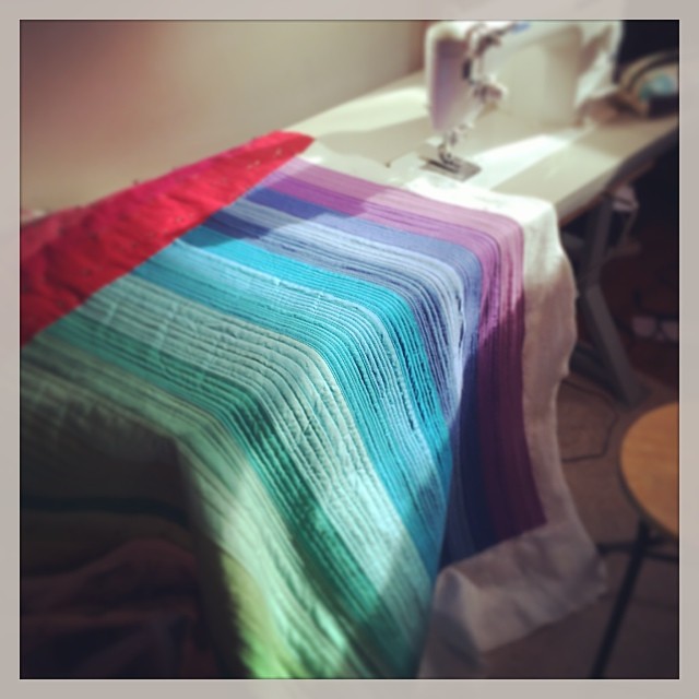
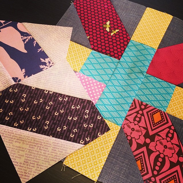
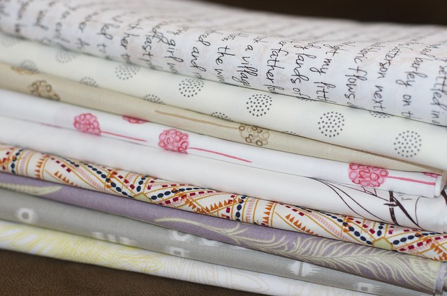
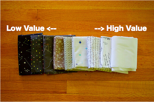
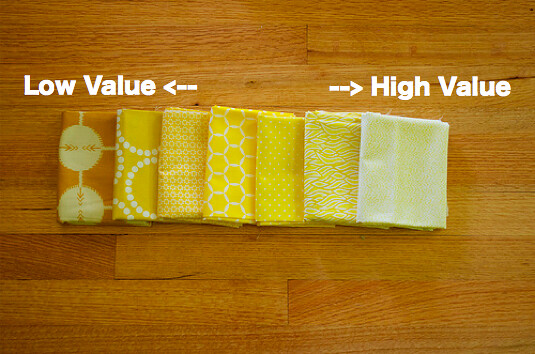
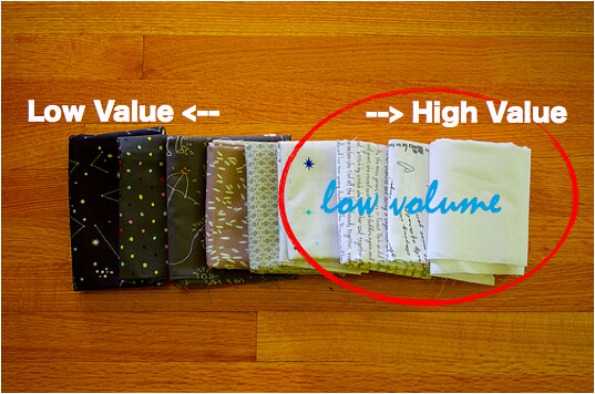
I like x and + blocks that are saturated and full of contrast like this beautiful example from a little gray.  I love the fussy cutting in Gone Aussie Quilting's version (full quilt here).  And there are a lot of other options out there such as doing an all low volume background.  My choices and notes below are just suggestions based on a saturated layout, you are all artists so pick what works for you!
Once you've gotten your fabric picked (and good luck I found picking my fabric was one of the hardest parts of this block) you can start cutting.
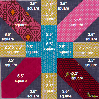
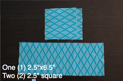
For your + fabric:
Screen shot 2014-03-16 at 10.32.36 PM

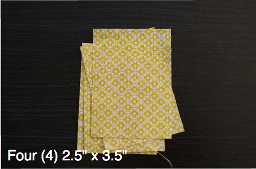
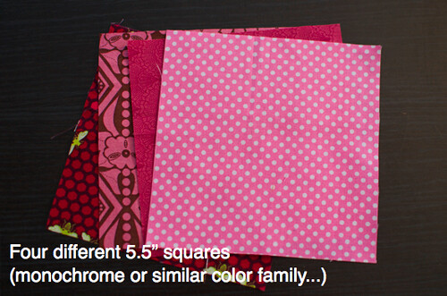
Fabric flanking the +:
Screen shot 2014-03-16 at 10.26.14 PM

Background fabric to x:
Screen shot 2014-03-16 at 10.13.11 PM

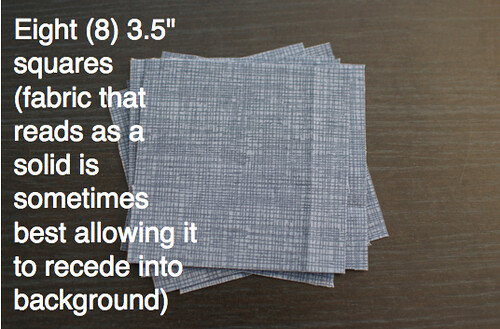
Fabric that forms the x:
5.5 Squares

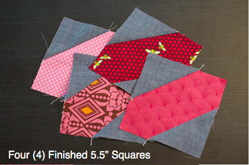
Step 2: Create the four blocks that form the X
Creating 5.5 SquaresScreen shot 2014-03-16 at 10.03.39 PMScreen shot 2014-03-16 at 10.02.19 PMScreen shot 2014-03-16 at 10.00.28 PM
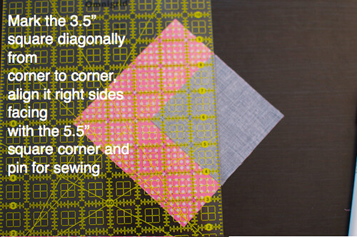
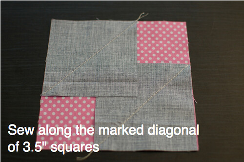
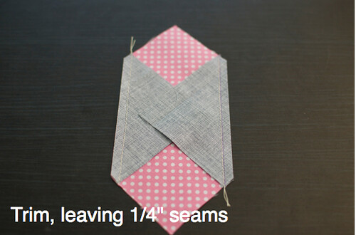
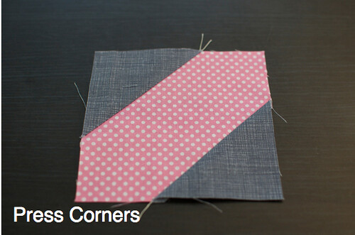
Repeat for each of your 5.5" and 3.5" squares until you have 4 finished squares... If you prefer chain piecing as I do, I suggest prepping all four blocks at once and sitting and chain piecing one after the other.
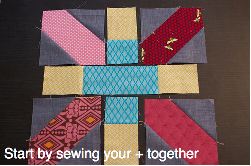
Finished 5.5 Squares

Step 3: Sew your +
I wanted to make sure my block was going to look just right before I put all the pieces together so before sewing my + I laid it out to move around the pieces and fix the layout.

I then sewed the horizontal strip for the + first.  REMEMBER: a scant 1/4" seam!
Untitled
Next sew the top and bottom parts of the +
Screen shot 2014-03-16 at 10.39.11 PM

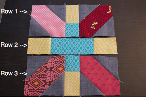
Step 4: Sew your rows
After completing your + you can complete the three rows for your block...
Screen Shot 2014-03-26 at 9.38.56 AM

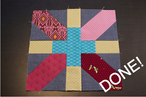
Step 5: Sew your rows together to complete your block!
Screen shot 2014-03-16 at 9.52.44 PM

Have any tips or tricks you use when making these blocks?  Leave a comment below!

- rebecca lynne


Thursday, March 27, 2014

Fabriholics Anonymous March Check-in

FabAnon
Whew!  Just getting this in right under the wire!  March is practically over...oh well that happens when busy gets busier...at least I can say that my time has been spent sewing...

So how has it been for you ladies and gents?  I, for one, was able to buy fabric this month in order to help a swap member get her fabric picks for the Low Volume Swap.  To be honest with you it made me feel a bit dirty!!!  It felt quite decadent to be perusing fabric, putting it in the shopping cart, changing my mind, and then eventually finalizing my shopping card and pressing Buy Now.  Agh!  What a thrill...  I still haven't spent my gift card yet and am debating how much longer I will be able to hold out.

Specifically, I am lusting over these right here...

I pretty much want this whole line...

What about you all?  How are you coping?  If you have any tips for your fellow fasters do share.  I am compiling a list of tips and would love to hear your ideas!

You know the drill, leave a link and visit two links above you.  Make sure to leave a comment when you visit!

- rebecca lynne


Wednesday, March 26, 2014

FMQ WIP

Patiently trying... #fmqbeginnerSkipped stitches...sigh. Too much spray basting?
I am in a quilting mood after completing the quilting on Above All Pink so I decided I needed to keep that motivation going and try to tackle another quilt top I have had lying around for awhile...  This time I decided to take on some free motion quilting.  Instead of pinning I spray basted, something I am not overly experienced with, because I didn't want to have to navigate my beginning FMQ skills AND the pins at the same time!  But, even after changing my needle, cleaning out my machine, rethreading, and doing all of those god things you need to do when something is funky with your sewing...I was still getting the occasional skipped stitch!  I googled it, of course, and came across this helpful post from Kati at Swim, Bike, Quilt.  I am thinking I should change my spray basting brand and also spray a little less heavy handedly...

Back to the drawing board!  Unpicking and deciding whether I am going to make a new attempt or do something completely different.  Hmmph.


- rebecca lynne

Friday, March 21, 2014

Ribbon Quilt Label

Finally, a proper label! @colelife @lifesrichpattern
For my faithful followers you may remember that I finished Joy, for the Queen last summer.  I was so proud of this simple patchwork quilt made of Anna Maria Horner's Field Study collection and a Cereopsis voile backing.  It was my first attempt at free motion quilting on a full quilt.  For months I debated how to label this quilt and now that she is going included in a local quilt show held by the Amherst Quilters' Guild I realized it was now or never!
Luckily, I had an epiphany when I remembered the AMH ribbon I uncovered in my stash while cleaning my studio.  At first it the idea seemed a bit excessive, I have been saving this ribbon for a long time...but then I decided this particular quilt is all about the Queen (i.e. Me insofar as my house is concerned) so why not!  After all nothing succeeds like excess!

- rebecca lynne

Tuesday, March 18, 2014

Above All Pink: In Progress

Above All Pink (Take 2)Above All Pink (bit by bit)Above All Pink (Progress!)Above All Pink (coming along well!). And yes @shecanquilt the pink is at top!  I'll get there last...
It seems ages ago that I started this...I guess it really was only a few months.  I had started the quilting soon after finishing the top but I kept getting puckering.  I asked my Guild and they all agreed that my pinning was spaced too far.  So I gave it a break, became good friends with my seam ripper, re-pinned the whole thing and started at square one...I am so happy I did because all the puckering is gone!  Only have the top pink part to go...

- rebecca lynne

Saturday, March 15, 2014

MODERN LOW VOLUME SWAP ROUND III CLOSED

CLOSED!

Modern LV Swap Round III

Final Swapper List Available Here.


If you are included in the swap you should have received an email from me.
If you did not receive an email but feel you should have please contact me here with questions.

- rebecca lynne

Tuesday, March 11, 2014

Modern Low Volume Swap Round III

STILL 10 SPOTS OPEN!
{March 12, 2014 at 17:24 EST}
Modern LV Swap Round III

CLICK HERE TO REVIEW INSTRUCTIONS AND JOIN.


All Swap Participants will be given a 15% Discount Code from Pink Castle Fabrics to purchase fabric for this swap!
Thank you Pink Castle!!!

Questions can be left in a comment below or emailed to me here.

- rebecca lynne

Monday, March 10, 2014

Weekend Doings

x and + ing it...x and + with some selvage of course!
HST LoveMore hst love
Would you believe that I cleaned my whole house (thoroughly), threw a very successful(!) Surprise Birthday Party, hung with the hubby and kids, finished some documents for work, coped with daylight savings stealing an hour, and STILL found time to sew this weekend?  
Oh yes, Spring is on the way.  I am getting my mojo back!
I prepped a tutorial for a 12.5" x and + quilt block in preparation for my month in the Modern Stitching Bee.  The x and + blocks resulted in some leftover HSTs which I decided I needed to make something with now otherwise...they'll just hang and get shuffled around and never used.  Thus, the two little heart blocks.  I have no idea what I will use them for (pillows?  placemats?  zip pouch?  incorporate into a quilt?) but I'm sure eventually I'll be inspired to give them a proper finish. 
Tutorial for the x and + block will be posted at the end of the month.

The Low Volume Swap is still coming - however, fingers crossed, I have a potential sponsor and am waiting to see if that is going to work out.  I will open Sign-Ups once I have heard back from them!

Hope you all had a productive weekend as well...

 - rebecca lynne

Saturday, March 8, 2014

Quilted Metallic Foldover Clutch [TGIFF]

UntitledUntitledUntitledUntitledUntitledUntitled
UntitledUntitled
I've wanted to make a foldover clutch for some time now...but wasn't sure how I wanted to do it.  I was debating whether to place seams to create the fold and then decided that might be too bulky.  Instead I decided to alternate the quilting and use that as the point for the fold.

I've been dying to use this metal zipper and fabric combination!  I used Nani Iro by Naomi Ito Little Letter Brushed Twill metallic fabric. I love how those pink flowers sparkle.  And to make the clutch even more over the top I sewed on some swarovski crystal beads to the foldover flap!

Now to figure out what to wear when I carry her during our next outing... Hmmm...

- rebecca lynne

Thursday, March 6, 2014

Low Volume 101


Low Volume Package at MRLs
This post was original part of the Colour Theory for Quilters series.  If you haven't ever checked out the Colour Theory for Quilters series I highly recommend that you do!   I asked Jess if I could repost this on my blog as I prepare for Modern Low Volume Swap Round III!

But, before we jump to Low Volume, we need to chat about Value.  Ready?  Let’s do it…


VALUE
In artsy terms, value is what we are talking about when we describe a color as "light" or "dark".  When we classify color as light versus dark we are describing its "brightness".  To be geeky uber-technical about it...warning: feel free to gloss over this if you are anti-geeky uber-technical by nature...value (or brightness) is based on the amount of light eminating from the color.  The more white the HIGHER the value, the less white the LOWER the value.  The easiest way to think of this is using a grayscale.  And of course this gives me an opportunity to use some fabric examples!
Screen shot 2013-06-26 at 9.15.27 PM
Of course the same value scale applies when we talk about any color...  Such as yellow for example.
Screen shot 2013-06-26 at 9.22.14 PM


Value Challenges for Quilters
To apply this information to what We Do as Quilters we need to recognize the challenges that we face in our medium...in other words fabric.  Painters, illustrators, graphic designers...pssht they've got it easy!  Quilters often use patterned fabrics that combine multiple colors and sometimes multiple values all in one swatch.  Depending on the scale of the fabric pattern if that swatch is cut in half the new swatch creates a change in value range.  For anyone who has ever tried organizing their stash in color order you know you've faced the question of "hunh, well where does this one fit in?"  The pile of fabrics I've depicted below demonstrates my "hunh" or "multicolored" fabric pile in my own stash. 
Untitled
To get past this challenge, my advice is to use the monochromatic feature on your camera or computer to judge the value of a particularly challenging fabric.  I've done that here with the yellow example from above.  You can see through grayscale how the patterns still have an important role in value.
Untitled

Creating 
Contrast using Value.
Right.  Okay, you get it, light versus dark, but why does this matter anyway?  Value is important because it allows us to create contrast.  If colors are close in value they will flatten, if they are varied in value then they will contrast and thereby create depth.  Too close in value = flat.  Far in value = depth.  Take the yellows up above, looking at them in grayscale you can see that the fabrics closer together in color blend together and fall flat.  But, I've taken the darkest yellow (low value) and the lightest yellow (high value) and paired them together below and now you can see the pop - value creating contrast.
DSC_0022 - Version 2        Untitled
This is example is also good because the darker yellow fabric has a lighter value pattern which, as you can see, also creates value contrast within the same piece of fabric!  Quilters, we have so many options!

However, if you've diligently read through these Colour Theory Posts then you don't need me to tell you Value is merely one way to create contrast.  Contrast can also be created with color through context as we learned in the last post.  In fact, to push this even further, as fabric enthusiasts we all know contrast can also be achieved by contrasting different textures or fabrics with different scaled patterns.  Oh fabric...how I love thee!  Quick Example?  Sure...

Value Contrast: As we've already seen above in the yellow, value contrast is an important consideration when pairing fabric.  See how it works with these blue solids I paired.  The depth is created by the range in the value.  The value pairing creates an impressive contrast in the grayscale.   This is why monochromatic pairings can often be so compelling.
UntitledUntitled


Color Contrast : But as you already know complementary colors create a wonderful contrast as well and do not require a difference in value.  Complementary colors = Blue and Orange.  I kept the same blue from above but chose an orange with a similar value.  While things look rather flat in the grayscale in color the fabrics vibrate against each other.  And it follows that using complementary colors with different values results in a greater contrast.
UntitledUntitled


Untitled


LOW VOLUME
So why did I march you through the preamble about value and contrast above?  Well...low volume of course!  The trick to low volume is to consider value and how contrast is created in the ways I mentioned above such as color, pattern, scale, and value.  If I were to tell you that all the fabrics above are considered low volume you may scratch your head and say what?  If you have done any research into the recent low volume craze then you know that what is considered to be low volume covers a vast range.  
Screen shot 2013-06-26 at 9.19.16 PM
What is Low Volume?
To put it simply...low volume fabrics live in the high value range of the value scale.  Nevertheless, one visit to the low volume swap flickr page demonstrates that there is a broad scope of what different quilters think of as low volume!

First and foremost, there is no "wrong way" to do low volume.  Please, how ridiculous!  However, after hosting two Low Volume swaps and fielding a multitude of questions on what qualifies as low volume I have found that low volume can be divided into two larger categories.  Pop Low Volume and Muted Low Volume.
Untitled
Pop Low Volume.  Best described as graphic prints amidst a neutral background, usually white.  This is the low volume style of Malka Dubrowsky who is credited with starting the concept of modern low volume in 2009 with an article she wrote for Quilting Arts magazine.  This style is still very popular four years after that article was written.  It is probably most commonly known in its implementation by Rita of Red Pepper Quilts.  I describe it as "pop" because the design style utilizes the high value background of the fabric as a foundation to allow the graphic print to pop out.  Place a number of these fabrics together in a quilt and voila you have a very cheerful, largely neutral quilt, with fun popping graphics playing against each other.  TIP:  If you gravitate towards this style of low volume look for fabrics with a large ratio of white, a single colored print or at the maximum a print composed of no more than two colors, and the simpler the pattern - the more graphic - the better.

Untitled
Muted Low Volume.  "If quiet had a color this would be it." - Sarah from Issabella the Cat's daughter when describing Sarah's low volume quilt.   {Go check it out, Sarah's quilt features fabrics from the first Low Volume Fabric Swap hosted on my blog.}  Muted low volume really is, well, muted!  This style utilizes fabrics in soft colors found in the high value range such as light yellows, light purples, soft grays, tans.  This style is not new to quilting as using muted low volume fabrics can be found in every period of American quilting.  Today one source of its popularity amongst modern quilters can be attributed to the beautiful Sunday Morning Quilt featured in the pages of the book Sunday Morning Quilts.  TIP: Thinking of putting together a muted low volume quilt?  In addition to gathering fabrics in soft colors and muted tones also consider choosing fabrics with "soft patterns" such as florals, small dots, scripted text.  Notice the bold chevron print above, in addition to the soft colors the pattern has a sketchy quality to it which softens the normally striking angles of the chevron.  Smaller scale prints will work well in this low volume style but what works best is a combination of different prints paired together to add some interest to this type of low volume quilt.  

No matter which style of Low Volume you prefer here is are some things to consider when picking your fabrics for your next low volume project...

Low Volume Fabric Considerations
  • fabric with a large ratio of white or neutral   
  • consider the complexity of pattern
  • minimal color contrast, a pattern with too many colors will distract from the neutral background
  • color element, brighter/saturated color for pop low volume, soft colors for muted low volume
And there you have it!  Low Volume thinky stuff.  By the way, all of the fabrics in the photos above were from my previous low volume swaps.  Cool stuff right?  Stay tuned for the Modern Low Volume Swap sign ups coming soon...in the meantime do check out the rules here.

- rebecca lynne