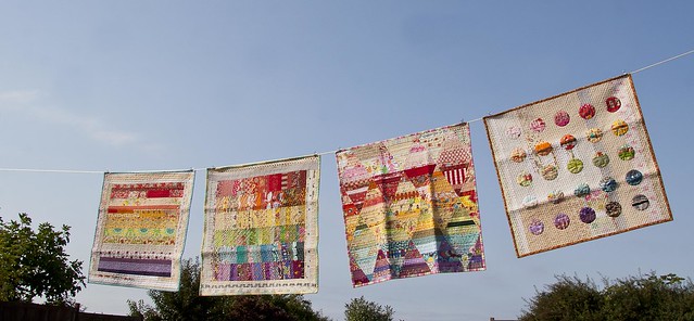
I've been working on this rainbow yumminess as some of you have seen over the past week or so. My idea is based on the awesome book Scrap Republic...you can see the Flickr site for the book here and check out this photo by Emily Cier below. The quilt I am working on is like the 2nd from the left called "Plumb". However, I am a bit stuck.
You see...in the book's quilt the rainbow block is a bit larger than my block and the border is a bunch of scrappy low volume strips. Hmmm...because my rainbow block is smaller I'm trying to figure out how to make a larger quilt. Why not make a small quilt? Uh, because I can't make Miss E a tiny quilt she wants a big one!
This has been one of those creative conundrums that has been distracting me at all times. You know the kind. I wake up in the morning thinking about it. I drive to work thinking about it. I go to bed thinking about it. I keep asking the Mr. his opinion - yeah you can imagine a) how far that has gotten me and b) how unpopular this line of questioning has become. Heh.
So what should I do? Here is what I am thinking. Ultimately I want to it be modern, I'm not really a fan of the traditional border thing, and anyway if I center the rainbow block it just looks funny because it is too small. [Block is 27" and I am aiming for 46"] I'm thinking of going asymmetrical...and instead of scrappy strips I am thinking all white so that the rainbow is really the focus.
To visualize my idea I pinned the square to the back of a white backed quilt to test my theory out!
But of course, taking photos was a struggle with this quilt in progress. Even the wind was against me.
But even as it lay there...it still looked SCRUMPTIOUS! Haha!
Okay okay in all seriousness. Doesn't this look like it has potential? The more I look at these pictures the more I like it. I think I am going to go for it. White asymmetrical border...makes my quilt bigger, rainbow is still the focal, and it still looks delicious. What do you think? Yay or Nay?
Hmmmm...now about the border...
Linking up to Freshly Pieced! What are your WIPs this week?
- rebecca lynne


14 comments:
look like a great plan to me. As you said, it was a lovely look even in the sliding pile! Go for it ~
:-}pokey
I'm going with YAY! I like the assymetrical quality you're adding.
Very interesting, you may just start something! =)
I like the white. You could add a red row and a grey row to make your rainbow block bigger first. Then add the white borders and a scrappy rainbow binding. Or, you could do what you'd like ;)
Ohh, I like it! Asymmetrical looks good! If you wanted to go all kitschy with it, you could applique her name in rainbowy letters in some of the white space. hehe ;) I really like how it is looking pinned to that white. Yum. I can't wait to see her pic with the finished quilt--she will be so beyond proud of it!
Yep, go for it - it'll be amazing!
Gorgeous....I'm sitting here drooling. Love the word schlump. I make up words, too, so I like that. :)
Maybe you could applique some rainbow flowers or her name in scrappy beauty in the white space? Just love asymmetrical!
I vote yay on the White asymmetrical border :) Love the picture of your quilts crumpled up on the deck - there is just something so happy and inviting about a crumpled up quilt :)
I love the idea of the off-center block on white! It's way better than the idea I thought off.
I was gonna suggest some light scrappy greys around the edge of the block and then setting it on white. But I think that the rainbow directly on the white will have a much bigger impact.
It will have a very modern look, which is awesome to me. Use black strip for the binding! It will bring out the coller more, or dark purple.
Um, YES. you absolutely must do this. it's the only way. great idea!
I think its a great idea! It'll really show off the rainbow block better =D
I love it! That's what heather (crafting...) did with her postage stamp quilt and it looked awesome! X
Definitely a YES from me. I think the white surround makes the rainbow colours shine even more and I love the asymmetric look in your photos :)
Rainbow colors + asymmetrical white space = LOVE! Add an energetic binding and you are so in business.
Post a Comment